Sean Flynn sat down with art director and UX (user experience) designer Jeff Soyk to discuss the design process behind Hollow, a community-based interactive documentary about rural West Virginia directed by Elaine McMillion. Hollow was recently recognized with a Peabody Award and a 3rd Prize in the multimedia category at World Press Photo. The Hollow team has generously shared documents that illustrate how they developed Hollow from concept to an award-winning interactive.
SF: How did you get your start as an interactive designer? What brought you to interactive documentaries and your work on Hollow in particular?
JS: My undergraduate education was in New Media Design at Rochester Institute of Technology and I immediately got a job after I graduated in advertising. I worked there for 5 years as an interactive designer and art director. I was doing a lot of Flash in those days since that was the hot thing, but also just landing pages, various kiosk experiences, full corporate websites, motion videos – things like that. But I really wanted to tell more meaningful stories. I was getting pretty worn down by all the corporate commercial work that we were doing, so I enrolled in the Emerson Media Art program to get more familiar with linear storytelling. I wanted to get more involved in film too and add that to my new media background. So I went there for the 3 year program and that’s where I met Elaine.
I didn’t really know about this genre interactive documentary, so I was just focused on traditional forms of film and sound design and things like that, keeping in mind how they might come to play with my interactive skillset. But then as NFB work started to come to light and I came across that, Elaine and I were having discussions about those types of projects. I thought there was some really exciting work out there. She told me about the story of Hollow, which she had already had in mind. At first it was just going to be a traditional film, but then she saw some opportunity making it interactive. She was putting a lot of work into researching it and working with the community and getting their trust.
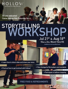
In the early part of the process, Elaine organized storytelling workshops with the community and conducted over 70 interviews.
I came on board just to help out with branding, because I was planning another thesis project, but it quickly became apparent that she needed more support on the interactive side. So I suggested we do a collaborative thesis and just make it a collaborative effort. From there it was an organic process of pulling together the whole team – friends and friends of friends – to find the developer and sound designer and so forth. We were really fortunate in terms of finding people to take the time and take a bit of a pay cut and make it a passion project all around.
SF: How did you bring together these two sides of your training (interactive and film) together in Hollow?
JS: That was one of the biggest challenges because the two mediums are kind of inherently contradictory. On the web, people want information as quickly as possible. It’s much more task-oriented. There are buckets of information. It’s very nonlinear in most cases. But with a film you’re creating these character arcs. We were trying to find that balance because we wanted to create a cinematic experience and have that immersion but also offer that level of control for the audience and hopefully get them to participate a little bit. I was just very cognizant of that the entire time – thinking about what the web’s standards and conventions are, all the things that have been ingrained in me through undergrad and working in advertising. And being aware of what traps not to fall into, because I think it’s very easy to just create a facade with interactive work that has the appearance of being something different. But if you push that facade away it’s actually just the traditional web conventions, which don’t assist the storytelling at all. It’s categorization of information basically.
We did a lot of market research early on and looked at every single interactive documentary that we could find. These examples helped us develop a strategic brief – really important to kick off any project – and answer some basic questions like: what are our goals and main objective? Who is the audience and why should they care? How do we measure success?
So what we ended up trying to do with Hollow – we had to make it somewhat linear, we had to offer a kind of linear path, but always feel like the user is in control and not being subject to roadblocks or having to make decisions arbitrarily. You need to have that kind of user incentive throughout. So initially we were only planning on using parallax scrolling in the introduction. It has been trending technique for awhile now, and maybe it wasn’t good to ride that trend at the risk of being distracted by the technology, but we realized that it actually benefited our storytelling process. I really feel like it gave the user control right up front where they could control the pacing and go forwards and backwards with ease. We can give that overarching narrative initial layer, and then create these mini-vignettes of sorts where they can choose to go a little bit deeper. So for us it was kind of that balance where you have the option of jumping around and it still makes sense in these mini-narratives, but there is an overarching narrative that they all convey as a whole.
SF: How did you arrive at the concept and structure for Hollow? What was the design process like?
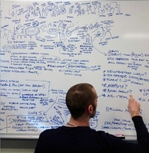
JS: We created tons of thematic lists, trying to understand all the content that we were gathering, the stories that were being formed throughout the summer during video production, and trying to understand the relationships between content. Also just being aware of all the various technologies that would help accentuate those elements of the story.
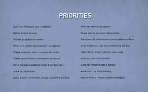
This document establishes a list of priorities for project – essentially core rules that we put in place for ourselves that we thought were really important. Having these on hand as a reference helped us make sure we didn’t get trapped in the conventions of the web. The list grew over time as we came up with multiple concept executions.
It was a long process and we went through so many concept iterations but it was all necessary. We all got in a room and it was hard to all align ourselves with one idea. There were just these fragments of ideas floating out there. We played a lot of things out that weren’t necessarily the best approaches, just to see how they might work in tandem with some of the content or just to see it not work and then axe it or iterate further. In terms of social media, we had considered “liking” and sharing being a bigger part, trying to encourage more user participation, but eventually we realized we had to cut back on that more. It was a distraction and an unrealistic expectation in a lot of ways. At one point, we were thinking that the video was really at the forefront and it was about how to make this video content itself interactive. And then we realized that we had this plethora of sound and imagery that we could collage together and create a more tiered approach to the storytelling.
So we created a lot of these sketches, wireframes and early Photoshop comps. Ideally you don’t do too many comps because they’re kind of a waste of time and lot of designers try to avoid them because it’s work that gets tossed out anyway. But it some cases you need it to help visualize what this could be. Depending on your team and people’s familiarity with the medium, it can be hard to translate sitemaps and wireframes into an understanding of what the user experience could be.
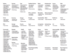
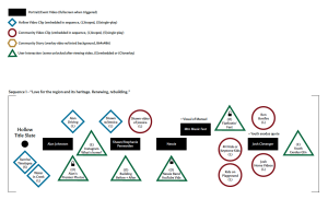
As Elaine was capturing video, we spent a lot of time talking through what was being captured and grouping content into themes. These theme areas actually came from the community during the first workshop. The second page is a snapshot of these themes along with some of the aesthetics and the content formats we were dealing with. The last page organizes these “buckets” of content into hierarchies so we could try to understand how all these ideas related to each other and how the Holler Home community website related to the user experience.
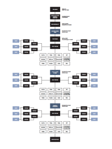
This document was created while we were still digesting the content captured over summer. One idea was based on a “day in the life” concept, so scenes are coded accoding to the time of day they were shot. Color codes indicate which themes each character illustrates and the lines between people indicate overlapping themes and relationships. Page 3 shows a tiered approach to the content, allowing users to dig deeper but not hitting them with stories too soon. Page 5 shows a “lifetime” concept that would have allowed users to experience McDowell county from childhood to old age. These don’t reflect the final structure of Hollow, but they were necessary steps to figure out what works and what doesn’t work.
This document is more reflective of the final version of Hollow. At this point we knew which individuals we wanted to represent certain ideas and how the community website would be structured.
This is an accordion sketch that shows how we’re placing community members side by side. On page 3, you’ll see placeholder text because we hadn’t yet figured out copywriting yet. We didn’t know exactly what we wanted to say here, but eventually we came across statistic about 1 in 3 counties in America is dying. Our researcher Tricia Fulks helped a lot with the copywriting, which is a key role that is often taken for granted in these projects.
These Photoshop comps act as a visual guide for the developers, showing how the animation elements would work.
SF: How did you figure out the right amount of interactivity in this early design phase when you hadn’t built anything yet?
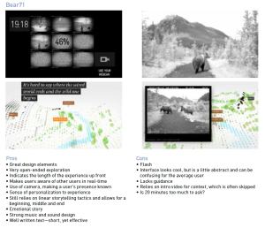
JS: When I saw The Goggles talk at SXSW, they talked about how so many people were recommending that they make certain things interactive in Welcome to Pine Point. They have a few elements that you can drag around and play with, but I think they were really smart in taking a step back and knowing when interactivity was validated – not doing it just because they could.
So we definitely played with some things like that – we could add this feature, but then we’d cut it out because we realized it wasn’t appropriate. A lot of the user interaction – things like the Instagram element and the Youth Exodus data visualization – those really just came together after we put together these mini-narratives. So we’re collaborating with all these people in the community, creating these mini-stories that are coming from them. And then we’re figuring out what data we had available to us, thinking about where will that help complement the story and not just be data for data’s sake. How will this fit within that narrative structure that we’ve created? It’s just knowing where to cut, where interactive features are actually accentuating one of the stories or individuals that’s being featured. We had a map at one point with taped pieces of paper and we were just moving stuff around constantly, shifting the sequencing to create that flow.
These comps show how we thought about embedding data into the visual space we’re creating, making sure its accentuates the video and other story elements. Elaine captured about 7TB of video, photographs and sound, and we spent a lot of time scouring through all of that to see how we could use it to deploy data. We also wanted to make sure the data visualizations and interactive elements didn’t take up too much time. You can’t expect users to participate right off the bat – you have to give them an incentive first.
We spent time going through the PSD comps with our sound designer Billy Wirasnik and he worked to determine when sounds would be triggered and what happens when users go forward and backwards. Billy created these documents to help translate that sound design for our developers.
SF: What advice would you give to filmmakers from a linear background approaching nonlinear, interactive work for the first time?
JS: Well if you have no familiarity with the medium, it’s definitely good to bring in some people as soon as possible to help you approach it from different angles. Compared to a fiction project where you have complete control of the story and can plan ahead, with an interactive documentary you might plan it one way initially and then start shooting and gathering stories. Then all of the sudden the story completely changes you have to rearrange your whole process. So a flexible mindset is really important. It goes back to developing multiple concepts and iterating upon them and being able to toss things out. But also not letting that put you off guard and make you feel like you’re not making progress. I think some people need that sense of control and get really anxious when they feel like a project is going off the rails. In actuality, you almost have to feel like you’re losing control entirely, but you regain that control later on in the project.
I think it is good to familiarize yourself with what goes into a medium, but that doesn’t necessarily mean learn a coding language. With film, it helps to be a director that has some DP or gaffing experience, because they can communicate better with that person. So getting your hands dirty is good at a certain level, just to appreciate and respect the work that goes into it. But it’s not like you have to become a master and be able to build something yourself. It’s more about communication and knowing certain parameters.
Also, it’s important to not fall victim to the temptation of technology. It’s so easy to see all the flashy things out there and people getting caught up in the “wow factor,” without actually being able to peel it apart, know how it was built, why it was built that way, what is making it successful or not. The more time you spend with those kinds of projects the more you start to recognize that kind of thing. For example, WebGL, which has been around for awhile, allows you to create a 3D environment, and it’s kind of like “3D environment = instant immersion.” But it might not be appropriate, even if it gets an initial draw because it’s a newer technology.
If you have the time and the resources you can create almost anything with interactive media – the possibilities are really limitless. It can be kind of overwhelming at first, but I think when you have a really strong core idea that you’re reminding yourself of, and you kind of work outwards from the center, that’s just so important. I know it sounds like a simple idea but I think so many people reverse engineer their work and they work from the outside in.
To learn more about Hollow, visit the project page on Docubase.
0 comments